

-
Recently Browsing 0 members
- No registered users viewing this page.
-
Latest Activity
-

By CharlotteB · Posted
Didn't even realise the website had changed. Will go check it out now! 👍 -

-
 The tracklist preview on Spotify is missing Conversation 16, Deep End, The Day I Die, Space Invader and About Today.
 -

By Hooskerdoo · Posted
Cheers. I know there will always be the acoustic-led and introspective singer-songwriter stuff and lots of great acts from other parts of the world, but I've been loving the "rougher" edge that has become more of a part of EotR over the last few years, so my list caters for that side. Just a part of the mix though. -

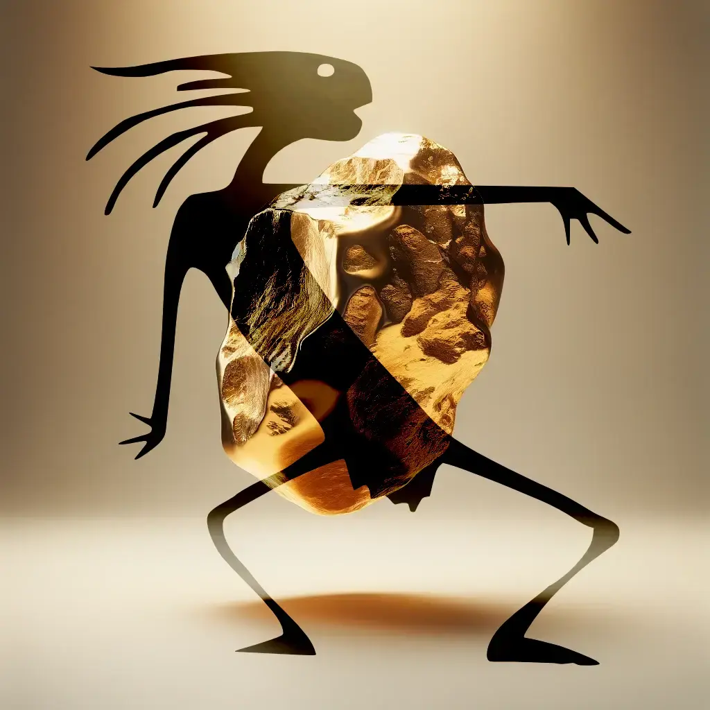
By illustration.toxic · Posted
just having a little fun and made this probably wont happen and wishful thinking but just wanted to make something for the fun of it
-
-
Latest Festival News
-
Featured Products
-
Hot Topics
-
-
Latest Tourdates


Recommended Posts
Join the conversation
You can post now and register later. If you have an account, sign in now to post with your account.