
-
Recently Browsing 0 members
- No registered users viewing this page.
-
Latest Activity
-

-

By tomarchbold · Posted
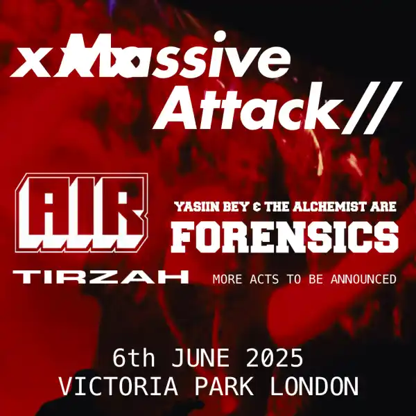
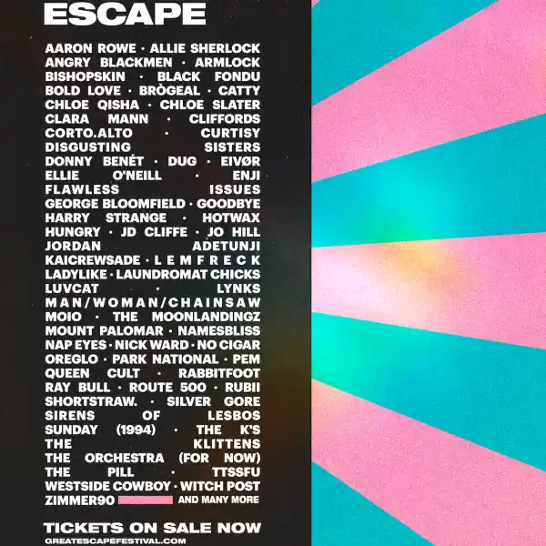
oh the staggered ones are such a pain to look at to me, works as you said for early announcements for me - vertical posters but with the artists own fonts for the top artists is the best. like 2019/2023 style -
 Vertical posters are so much nicer to read. Dont mind the rows we have this year so far for when we only have a few names much better than the staggered posters they were doing a few years back
 -
By tomarchbold · Posted
oh for sure, as soon as stage splits are introduced everything certainly starts looking a lot more real beg that it’s a vertical poster again. they just look way better -
 My rule of thumb is that any time someone takes a photo of something on a phone or computer screen, it's done to try and make it feel more sneaky, in a false attempt to portray it as a leak. And can be dismissed as fake on that basis alone. I don't think I've been proven wrong yet.
-
-
Latest Festival News
-
Featured Products
-
Hot Topics
-
-
Latest Tourdates


Recommended Posts
Join the conversation
You can post now and register later. If you have an account, sign in now to post with your account.